An event landing page has one job. It moves a specific person to register for a specific date. Everything on the page either helps that happen or delays it, and event landing page design is mostly the work of cutting the second category.
The page also has to survive contact with reality: a visitor on a phone in a moving auto, a payment that fails at the last step, and an organiser who needs the attendee list in a spreadsheet by Friday. Those details are where most pages fail, not in the hero image.
What event landing page design is for, and when not to build one
A landing page serves one audience, one date, and one action. The organiser’s homepage does something different. It carries news, past editions, sponsor logos and a blog, because it has to serve everyone who has ever heard of the event.
That distinction decides the build. A single day workshop with one audience needs a page. A three day conference with delegates, exhibitors, speakers and press needs a small site, because one page cannot hold four different next steps without turning into a menu.
The Bengaluru Tech Summit front page opens with the dates, 17 to 19 November 2026, then offers about, organisers, conference and committee as separate paths. That is a site doing its job.
If your event has more than two audiences with different actions, stop reading outlines and sketch the information architecture first. The rest of this still applies to each page inside it.
The eleven things the page cannot ship without
Here is the list, in the order a visitor checks it.
- Event name and the full date, including the day of the week.
- Venue name, area, and a map link that opens directions.
- Price, what it includes, and what it excludes.
- The schedule, at least start and end times, in detail for a paid event.
- Who is speaking, performing or exhibiting.
- One piece of proof from a previous edition.
- A register button that is visible without scrolling.
- A payment path, or a clear line saying payment happens at the venue.
- What happens after registration, stated in one sentence.
- A phone number or WhatsApp link for the questions the page cannot answer.
- A way to share the page, because most registrations arrive from a forwarded link.
Three of those get skipped most often, and they are the three that cost registrations.
The price gets hidden when the number feels high, in the hope that the page can persuade first. What actually happens is that a visitor with a budget question leaves to find out, and the tab does not come back. Show the number, plus a line on what it covers.
The schedule detail is no better. “10am to 5pm” is a venue booking, not a schedule. If someone is deciding between your workshop and a Saturday at home, they need to know when the useful part starts.
Then there is the after. “You will receive a confirmation email” does not answer “what do I get for ₹499”. Say whether lunch is included, whether the session is recorded, and who keeps the recording.
The two decisions that fill seats
Need a website built properly?
Fast, modern, fully owned — from ₹7,999, delivered in 1–2 weeks.
Chat on WhatsAppSee pricingA deadline and a price do more work than any layout choice, and both are decisions the organiser makes before a designer opens a file.
A real deadline looks like this: early registration closes on 20 November, or 120 seats and 42 are left. A fake one looks like a countdown that resets when you reload the page. People notice, and the ones who notice are usually the ones who buy expensive tickets.
Seat caps are worth publishing even when the cap is generous. “120 seats” tells a visitor this is a room, not a webinar nobody is attending.
Free events need this more, not less. Nothing on a page is more confusing than an event with no price, no capacity and no agenda, because the visitor cannot tell whether it is a serious event or a sales pitch with a projector.
What changes by event type
The eleven items stay the same. The emphasis moves.
Conferences and summits
Agenda and speakers carry the page. A conference is bought on the strength of who is talking, so the schedule belongs above the fold and every speaker name should link to something that shows they are real.
Expos and exhibition stalls
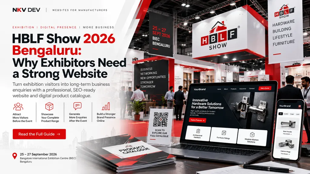
Two different pages get confused here. The organiser needs a visitor page with a floor plan, exhibitor list and badge registration. An exhibitor needs their own page, because the organiser’s site will not rank for their product and will not capture their leads. A stall page needs a catalogue, a QR code and a WhatsApp button.
Workshops and training
A workshop is sold on what the attendee can do at 6pm that they could not do at 10am. This is the one event type where a detailed syllabus converts, because the buyer is comparing against free YouTube.
Festivals and concerts
Festivals are bought on lineup, gates, age limits and transport. Ticket tiers have to differ in something a buyer can feel. Almost everything else is noise, which is why a festival page can be short and still work.
Webinars
A webinar decision rests on the time zone, the duration, and whether the recording arrives afterwards. Put the time zone in the same line as the time. “7pm IST” answers the question; “7pm” produces three emails.
Registration that actually completes in India
Most of the traffic arrives on a phone, and half of those visitors will abandon a form that asks for a company name before it asks for anything useful.
Four fields is the ceiling for a paid event: name, phone, email, and one qualifier such as a session choice or a dietary note. Everything else is data you can collect later or do without.
For payments, UPI is the default expectation and Razorpay or a similar gateway covers UPI, cards and netbanking in one checkout. If you sell to companies, say on the page that a GST invoice is available, because a finance team that has to ask is a purchase that stalls for a week.
Payment failures need a plan. The buyer who reaches the checkout and fails is the warmest lead you will get all week, so capture the phone number before the payment step, not after it, and send a payment link on WhatsApp.
WhatsApp also beats email for the confirmation. A message with the date, the venue pin and a calendar file gets read within minutes. An email from an address nobody recognises gets archived. WhatsApp’s click to chat links make this easy to wire up, and a prefilled message means you can tell which event the enquiry came from.
Then the thank you page. It needs the confirmation, the calendar file, a map, and one line about what to bring. That page is also the only place to put analytics that prove registration worked, so test it before launch, not after.
Templates and builders, and what they cost
An event landing page template solves layout. It has no opinion about your schedule, your refund policy, or whether the venue is reachable by metro. Those are the parts that decide whether the page works.
Builders are a fair deal for a one-off event with a small budget. The monthly plan is cheap, the page can be live in an afternoon, and nobody needs to learn Git. The catch shows up in year two, when the same page is rebuilt for the next edition inside the same subscription, and the attendee data lives in someone else’s account.
For a workshop with 60 seats, a form tool plus a static page is enough, and free. That option stops working when you need a schedule that changes daily, multiple ticket types, or a page that ranks in search between editions.
The coming soon page, for events still months out
Before the agenda exists, publish three things: the date, the city, and a waitlist. That is a complete page. It gives you an email list while you negotiate the venue.
A countdown timer on a page with no information is decoration. It creates urgency for a decision nobody can make yet.
Launch, and the five channels that send traffic
The launch checklist is short and every item has failed on a real project somewhere: page live on the real domain, form tested on mobile data rather than office wifi, one ₹1 payment run end to end, analytics firing on the thank you page, QR code printed and scanned from two phones.
Speed belongs on that list because it decides whether paid traffic pays for itself. Google’s Core Web Vitals guidance puts a good threshold at 2.5 seconds for the largest contentful paint, 200 milliseconds for interaction, and 0.1 for layout shift, measured at the 75th percentile of real loads. An event page has one image and one form. There is no excuse for failing any of those.
Then, in rough order of return against effort: your email list, a WhatsApp broadcast to past attendees, the link in your Instagram bio, the QR on every printed poster and stall, and retargeting for people who visited and did not register.
Measure two numbers. Registrations per hundred visits tells you whether the page works. Registrations that turn into attendance tells you whether the reminder sequence works. A page with a 40 percent registration rate and a 50 percent show-up rate has a follow-up problem, not a design problem.
What three real event sites do that a gallery will not teach you
I pulled the front pages of three Indian events that sell tickets for a living.
The Bengaluru Tech Summit leads with dates and a theme, “AI & Beyond”, then splits into conference, exhibitors and press. It serves several audiences and does not pretend they are one.
Sunburn leads with the lineup and a ticket action. There is almost no prose on the page, and it works because the brand already answers the question the prose would have answered. Most festivals cannot copy this, and copying the look without the brand is how you get a beautiful page that sells 14 tickets.
Comic Con India runs a city selector at the top with separate registration paths for Mumbai, Delhi, Hyderabad, Chennai, Kochi and Pune, plus volunteer signup. One brand, many dates, one page doing routing duty.
The pattern worth stealing is not the design. It is that each page commits to a single action: register, buy, sign up to volunteer. The design then gets out of the way.
After the event
The page almost never gets updated, which is a waste of the only asset an event builds. Swap the register button for the recording or the photo gallery, publish the next date while the audience is still paying attention, and put the attendee list somewhere it will be used.
If you marked the page up with structured data, keep it honest. Google’s Event structured data needs at least a name, a start date, and a location with a full address, and stale markup for an event that already happened does not help anyone. Either update it for the next edition or remove it.
Start with the date, the price and the action
Before choosing a theme, write three lines on paper: the date, the price, and the one action you want. If those three lines are clear, any competent build will work. If they are not, no template will rescue the page.
If you are building the page and the registration flow for an Indian audience and want it done once, tell us about the event. We build event and exhibitor pages from ₹7,999, and the exhibitor website guide covers the stall side of the same problem.
Sources
- Google Search Central: Event structured data, for the required properties and what the markup is for
- web.dev: Web Vitals, for the 2.5 second, 200 millisecond and 0.1 thresholds and the 75th percentile method
- WhatsApp Help Center: how to use click to chat, for prefilled chat links
- Bengaluru Tech Summit 2026, for dates, theme and audience split
- Sunburn Festival, for the lineup-first page structure
- Comic Con India, for the city selector and separate registration paths
Tags
#event landing page#event landing page design#event registration page#event website india#landing page